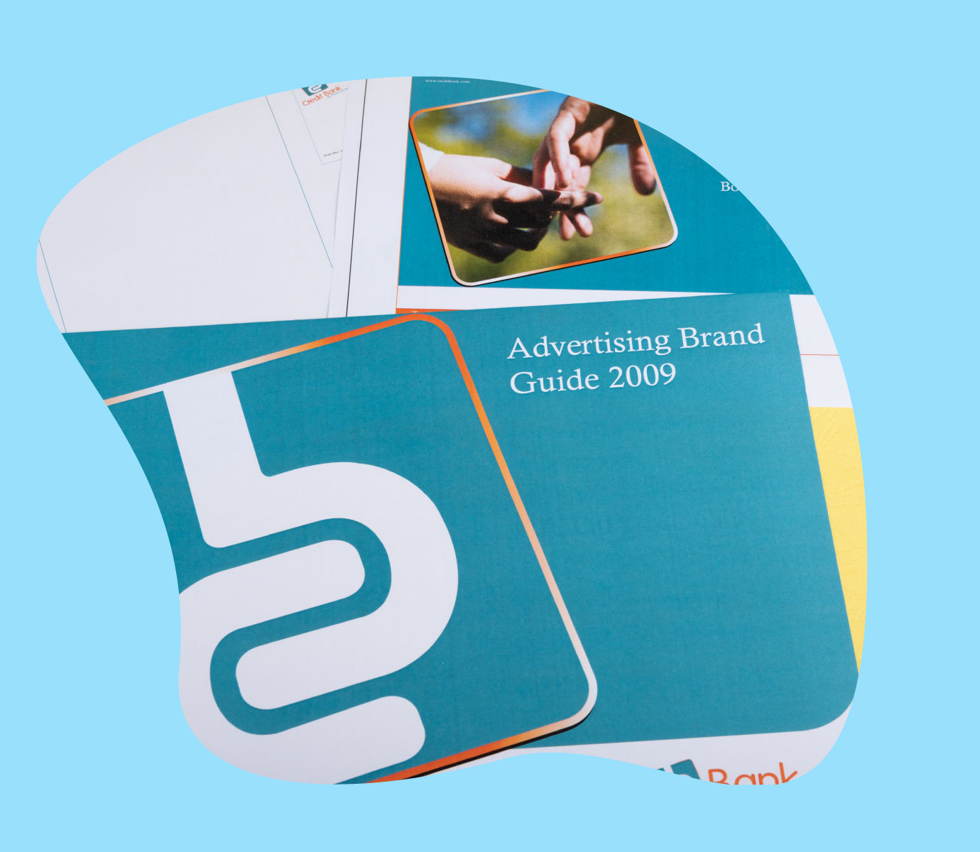
Credit Bank has a long-standing heritage in providing fast, friendly and affordable tailor-made banking solutions to its customers across various markets.
The Before
The logo had a few challenges which primarily revolved around the icon. This made it difficult to use against solid-coloured backgrounds and across media. The use of a gradient as well as a faux shadow to give it a 3D impression added to the colour palette an unnecessary colour. The icon shape also informed the style which felt restrictive to the creative process (this has been explored in the brand guideline case study here).

The Outcome
Simplicity is all. The logo was simply cleaned by removing the faux shadow, using a cleaner border on the icon as well as giving it rules on how to be used against solid backgrounds. This simplification might seem minute at first but once you consider the production application requirements, it becomes easier to see its importance. Scenarios such as embroidery hadn’t been put to thought when using a gradient in the prior logo.
Conclusion
Our years of experience can help your brand refine its investment i.e., the brand identity. With a simple solution, we were able to fix the logo and cut down on future production costs on brand collateral while still maintaining the original brand identity as per the client’s request. Talk to us today and see how we can refine your brand to the next level. Starting out? Check out our brand packages below.