A bigger picture for the taxi industry.
Overview
Not many entrepreneurs can venture into a brutally competitive industry, an industry that has been around for decades. The brave hearted men launched a brand striding for the better. They took a shot at the “taxi industry”, one that has been faced by turmoil in recent times thanks to technology.
We worked with Greyhound Holdings Ltd as their branding agency to develop their brand identity, style guide, and website. This is a case study of the design and development of their logo

The Brief
When entering any market, it is crucial to have a key differentiation strategy. There are many taxi companies around, but Greyhound combines convenience, affordability and technology… oh, and serious class!
The name Greyhound is derived from an intelligent racing dog striving to be ahead of the curve. The ideology of the name is to get you anywhere, fast and safely. It is service above par. The service is more than a taxi service rather a travel solutions partner. This is essentially what the brand does.
The focus is the corporate market in which they see the opportunity to provide customized travel solutions. For us at Pulsar, the objective was to articulate the brand visually following our brand development process.
The Creative Process
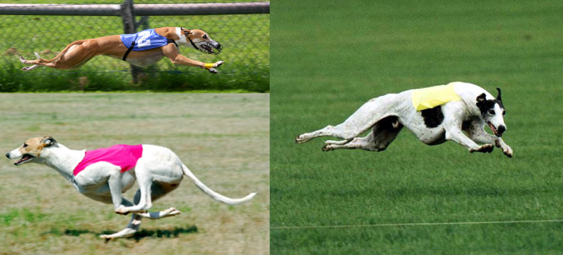
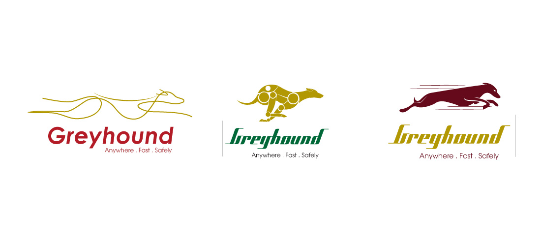
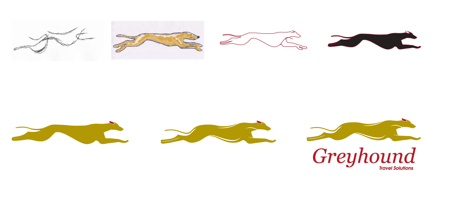
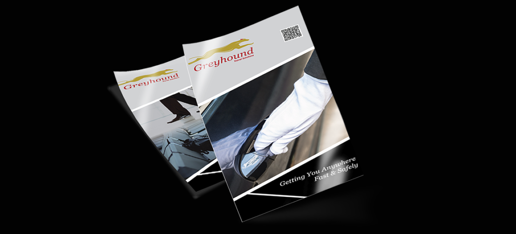
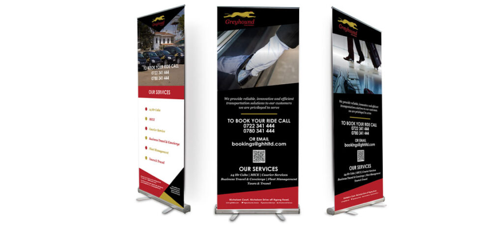
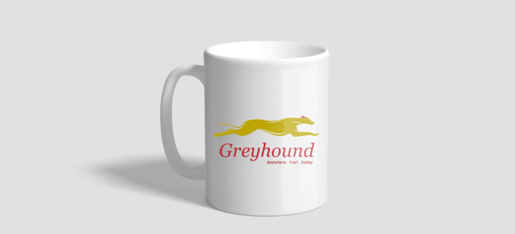
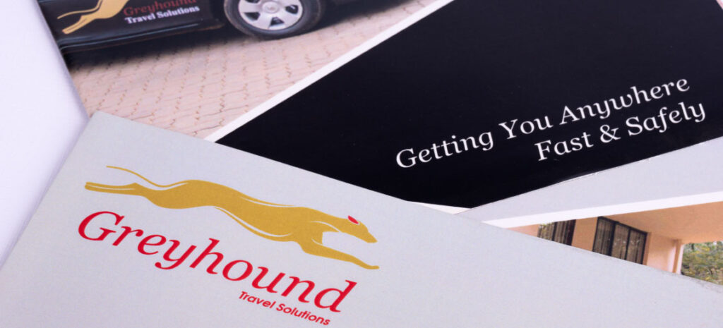
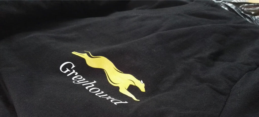
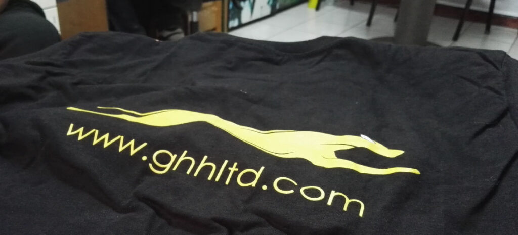
This project was all about collaboration. A focus on bringing varied ideas together to form creative synergies.
Conclusion
Working with Greyhound Limited gave us the opportunity to learn something new. We learnt how to work with a team of more than 5 people expressing their ideas differently. Harnessing their ideas into one focal point was a challenge, a challenge we took on and presented an icon in the travel industry. An icon that will take on incumbents and create a leader in the industry with cutting-edge solutions.
An icon that is Greyhound!
Ready to design your iconic identity? Check out our startup branding packages below.