For a full list of publicly listed companies in Kenya, we downloaded a report from the NSE website on 12 March 2023. For financial institutions in the banking sector, we downloaded the 2021 annual report from the CBK website on the same date. That is a total of 61 listed companies and 39 financial institutions (11 of which are listed).
For each brand, we downloaded their logo from their respective websites, sampled the colours and grouped them. Grouping is necessary as the number of colours varies greatly (unique as each brand out there).

While on the brands’ websites, we looked at the look and feel compared to the brand identity. This helped in understanding how the brands use colours from the brand identity. Whether they use one, all and to what degree. Here’s what we found out.
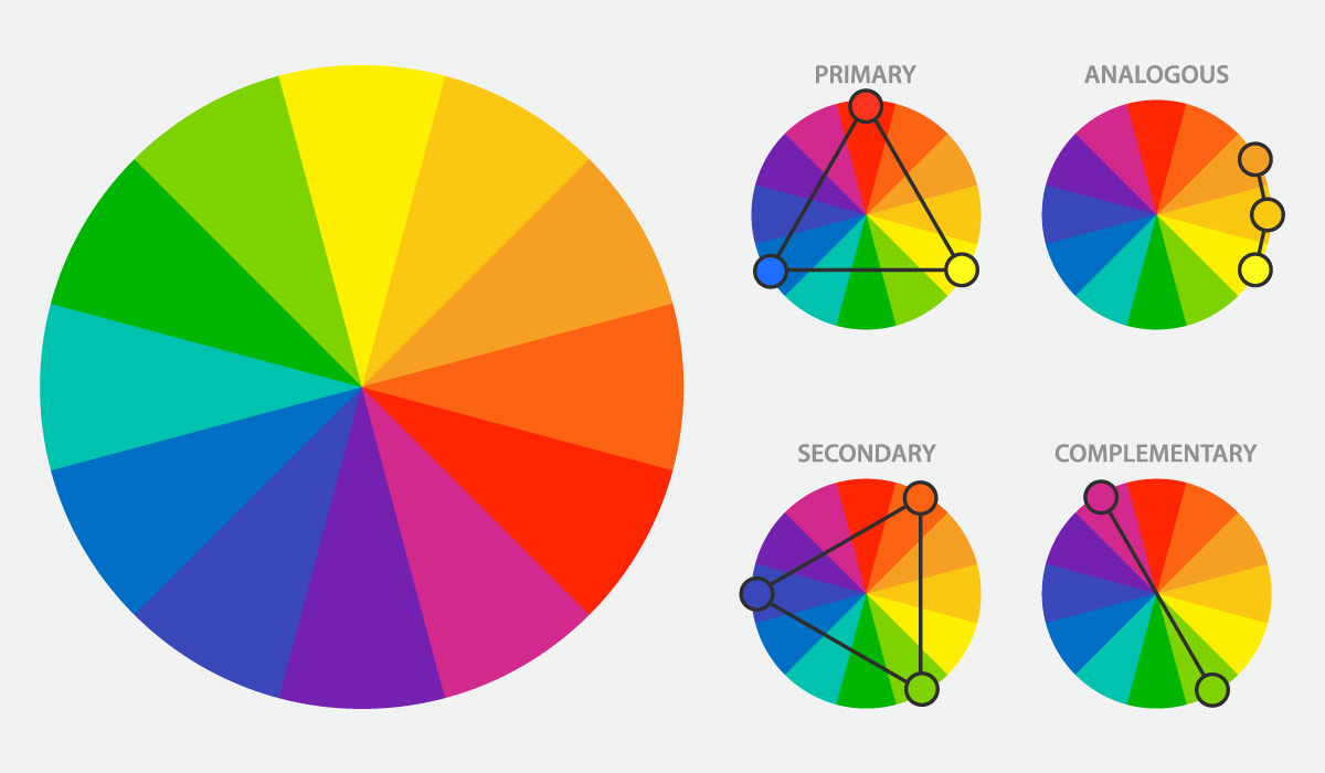
A very quick lesson on colours. Red, yellow and blue are primary colours. Orange, green and purple are secondary colours. When you mix the primary and secondary colours, you get tertiary colours. Our groupings were based on the primary, secondary colours and then some to make analysis easier.
For brands, blue is used to signify trust – and surprise no surprise, the banks use it often. Even where it wasn’t there dominant colour, an extra 10% of them use it as an additional brand colour.
You can use blue to further signify order, stability and relaxation. It symbolizes trust, loyalty, wisdom, confidence, intelligence, faith, truth, and tranquillity. Use light blue for softness, use dark blue integrity, knowledge and wisdom.
I See Trees of Green… Red Roses Too…
What a wonderful world because, green was not even next on the list. Red was the second most dominant colour used by listed brands. In fact, including certain shades of maroon & brown under red grouping, we get almost 30% of them using it. However, for financial institutions, 26% of them use green as their most dominant brand colour (so green comes in second for them). Let’s take a look at both.

Red in nature is a “shocking” and vibrant colour to look at. It dazzles and attracts us, yet in some instances can warn us of danger – think of blood. Let’s just call it an intense colour. It is full of passion, desire, anger and it can put you on edge. Brands that use this colour have to master it before it masters them.
Use dark red to showcase vigour, willpower, courage but be careful as it denotes anger (but you can master this carefully). Use light red for joy, passion, sensuality, sensitivity, energy and love. Pink signifies tenderness, friendship, and it is feminine. Reds that edge closer to brown suggests stability (some banks use it – Equity Bank) and denotes masculine qualities.
What About Green?
Finally, I get to the green I thought would be first on the list. I was green on this until the results of the research. In nature, green is the colour of nature. As opposed to blue, it could be the most abundant real colour – no illusions this time.

For brands using this colour, they’d like to associate themselves with growth, nature, nurture, prosperity and even a fresh start. It also a calm colour especially in its darker tones. The darker tones can have almost the same meaning as dark blue – think olive green and its maturity, stability and even peace. Avoid yellow-green if you can as it can indicate malaise, discord and more (tactfully and tastefully combined as an additional colour can help its case though).
Black is Not a Good Colour for Kenyan Brands
Yes, it is associated with elegance, power, formality, evil, death and mystery. As a growing brand, it is very hard to harness the power of black as it is not a visible colour. The listed brands that have used black and/or grey aren’t doing so well. Avoid, if you can. If it is a must, work with another colour to make your brand stand out.

Surprisingly, some of the largest brands in the world use it. It is a trend adopted by brands such as Apple, Samsung, and many luxury brands. The reasoning behind it is its safety of use around the globe. That plus they have a huge portfolio of items to brand that black makes economic sense.
But… black can give you an edge when coupled with another colour as it matches with any other colour – almost singing black and yellow right now!
Speaking of Yellow…
… and orange too. The warm ones. These two colours are almost in the same range and are rarely used as primary colours – we should have more of them though. 16% of listed brands use it as an additional colour to their dominant colour. For banks, including gold, that is 31% of the brands use it as an additional colour.

These two colours offer the attractiveness of red without the baggage of red. For brands, use this colour to show joy, happiness, cheerfulness, enthusiasm, celebration and more. Gold on the other hand symbolises wealth, prestige, high quality and one of a kind. Exclusivity.
The Rare One!
Purple. I’m surprised it was the only one. The brave brand using this colour is Kengen. Of all the things purple means, it is very hard to put a pin on as to why they used purple. It is associated with royalty – mainly because it was historically a rare dye that traded for more than the price of gold.

As a brand you can use it to symbolise power, luxury, wealth, and extravagance. Light purple is feminine and a safe bet for children’s products.
How Many Colours Should You Use?
In our research, 61% of listed firms use two or more colours while for financial institutions it is 85%. Combining colours is an art form that should be carefully considered to convey the right brand image. Not only should you apply the additional colours to your brand identity but you should actually use them in your branding efforts. 18% of financial institutions and 13% of listed firms had an additional colour in their brand identity but used those colours sparingly or not at all.
Our take, employ the use of two colours to give your brand a unique personality.
Avoid Gradients, they are Expensive!
Experienced designers… no, let’s put it this way. Designers with experience in printing know this too well. Nothing will give you more headaches than an identity with a gradient. From our research, 5 listed brands use them – but as a growing brand consider your limited resources.
It is important to futureproof your brand by making important decisions such as this from the beginning. I should be a shareholder in one of those companies to question the production expenses attributed to the identity having a gradient. Lol.
The only way you get away with a gradient is by being a digital only brand, which is hard – in future you will definitely need merchandise. Printing merchandise uses old school equipment that don’t like fancy stuff like gradients.
Our take, avoid them!
In Conclusion
As with all these colours, cultural context is relevant. It is important to understand your audience. There’s an entire field of colour psychology and its influence on how we purchase. Thus, colour is critical to your brand’s positioning.
Our westernisation simply means most colour meanings for brands work the same here. Our traditional African colours and patterns also offer something most brands haven’t taken advantage of. It could be something unique brands can take advantage of.
We are a creative agency with expertise in developing brand identities. We consult with brands as well to develop brand standards that help grow the brand by giving them consistency.
Get in touch with us today to colour your brand!


